Judge A Map By Its Cover

Cover objects are a core piece of a level designer’s toolbox, and there are many ways to use them. The examples below look at de_dust2 from Counter-Strike: Global Offensive, but some of the same concepts apply in other first-person shooter level design.

For those unfamiliar with the basics of Counter-Strike, the defusal game mode pits a team of attackers (Ts) against a team of defenders (CTs) in a series of 1-life rounds. The attackers win a round by planting and detonating a bomb at one of the two bombsites, or by eliminating the defenders. The defenders win a round by eliminating the attackers, defusing the bomb, or by running the clock out.

A full round of Counter-Strike tends to have a few phases of play:

  1. Attackers probe the enemy defenses for information and opportunities to gain map control.
  2. Attackers commit to taking one of the bombsites, spending utility (smoke grenades, flashbangs, and molotovs) to gain an advantage in the fight.
  3. If the attackers succeed in planting the bomb, defenders now have an opportunity to attempt retaking the bombsite against the attackers. This behaves as a kind of role-swap where attackers are now defending and defenders are now attacking.

Cover plays many roles in each of these phases.

Also for context, this article isn’t about competitive Counter-Strike map theory and tactics. My interest is as a level designer and my experience with de_dust2 is as a casual player where some of these patterns play differently from how they play in the esport scene.

Freestanding Cover

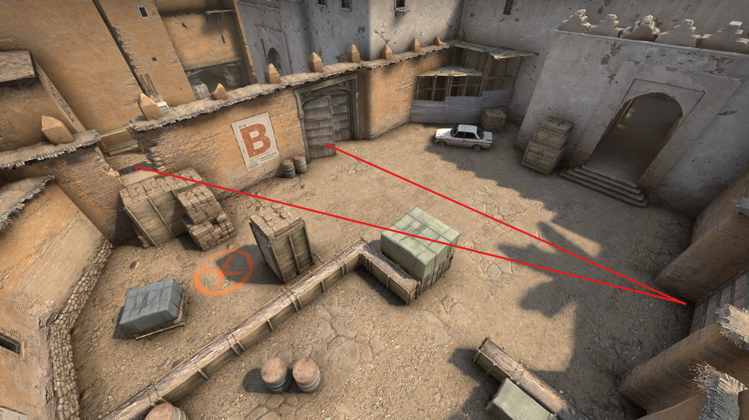
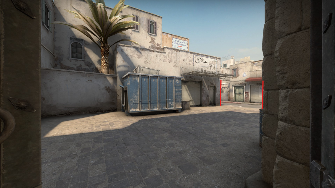
Freestanding cover objects provide a full loop of pathing around them. Players can use these cover objects to hide or hold against many angles. Here on B site for example, a player can use the tall box to hide from upper tunnels (left of image center), or to hide from window and defender arch (off screen to left)

Each line here is an angle this tall cover can block. Pink is to defender doors. Red is to window. Blue is to upper tunnel.

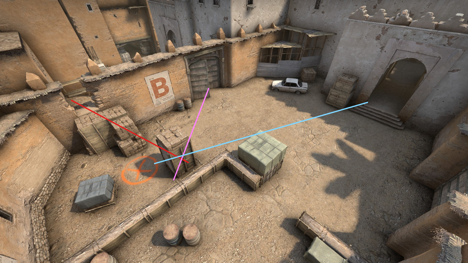
Freestanding cover leaves options open. A player can choose to peek from either side, loop around it, or disengage. They can choose to hold close to the cover and try to peek wide and fast, throwing their opponent’s aim, or they can try to back off and play from range. So long as they are in an even fight, they have options to play that cover to their advantage. Even in a 1v2, freestanding cover can help the outnumbered player juke and stay alive, burning precious seconds off the clock.

Because of this versatility, freestanding cover tends to work best on objective sites where players may duel or attempt to run the clock down.

Directional or Team-Favored Cover

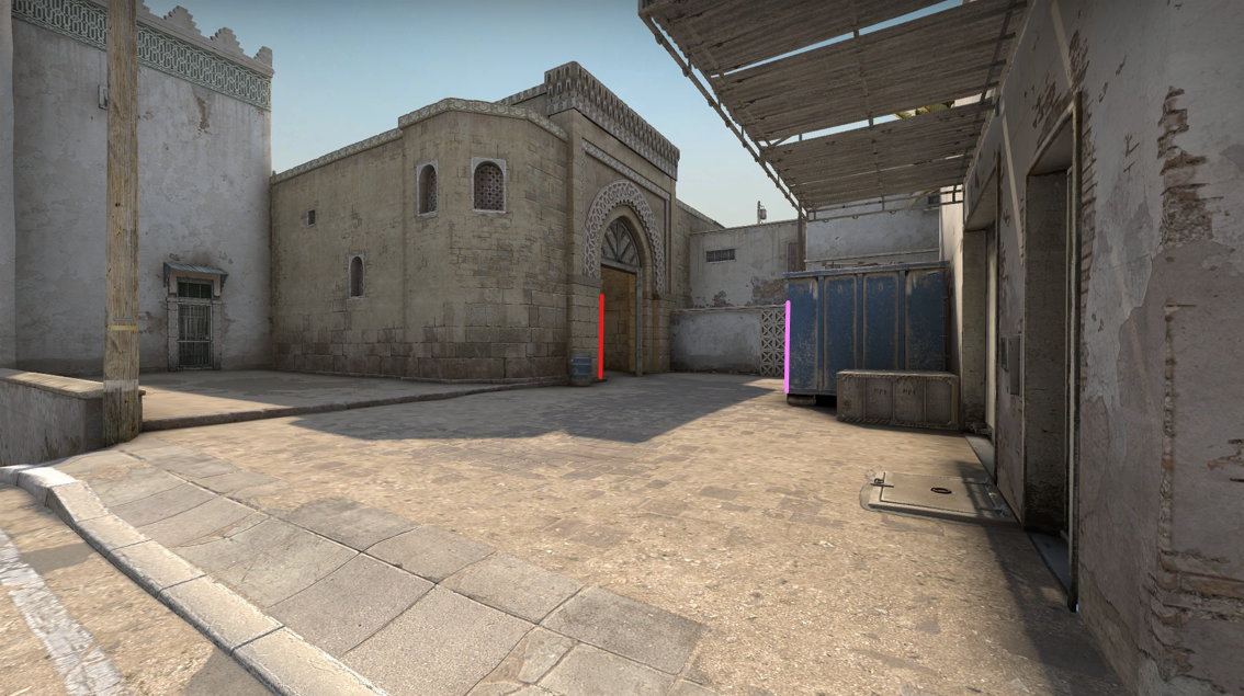
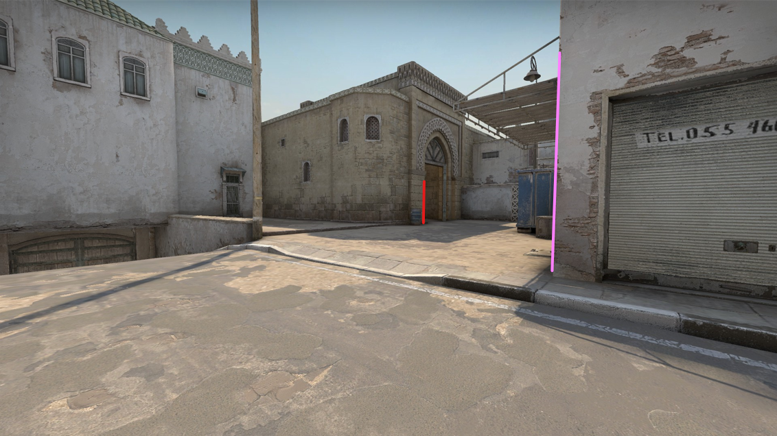
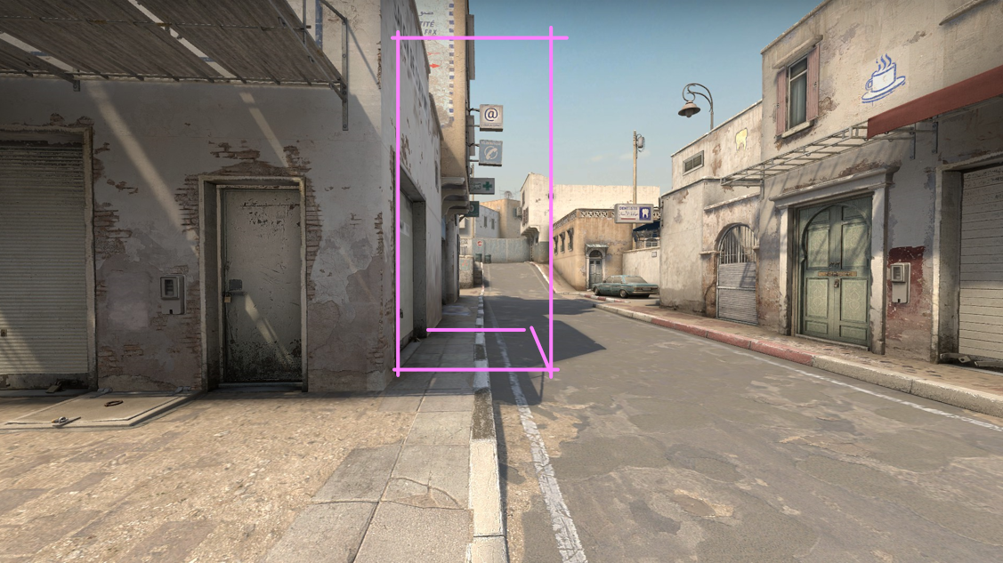
On de_dust2’s B site, there is a cubby in the wall where a large wooden gate is shut. This recess is deep enough for a player to hide behind the post and use it as cover against an attack from the upper tunnels.

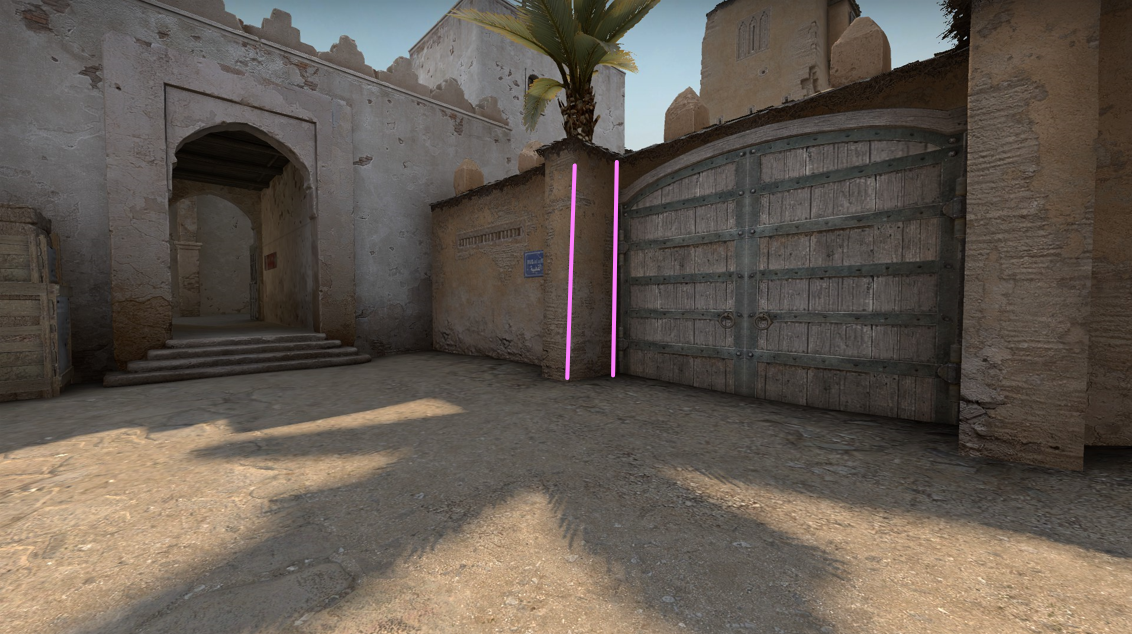
The team-favored quality of cover depends on how each team approaches it. For the defending CTs, this cubby is fully visible; they don’t need to clear those angles when they enter the site. But for the attacking Ts, this cubby could hold a sneaky player, and they could lose the round if they don’t clear that angle.

How the cubby looks to a defender holding against upper tunnel
How the cubby looks to the attacker attempting to push into B site

Even once the attacker has cleared the cubby, they can’t use this same cover against the defenders. The cover offered by this cubby is only useful against upper tunnels. Even worse, the cubby is exposed from the defender archway, which means attackers can’t use this cover when they are holding the B site against a defender retake.

Red lines mark the angles from which the cubby is exposed

Although this cubby is defender-favored, it still requires a big commitment. If attackers throw a molotov into the cubby, that defender has no good options. Unlike the freestanding cover on the site, the cubby doesn’t allow a defender to disengage without being spotted.

The cubby is also small enough that a long rifle muzzle can stick out. The defender in this cubby either needs a short-barreled weapon or to play anti-flash (looking at the wall) and wait for a teammate to provide info. A deeper corner, which could hold more defenders or give a single defender more options, would significantly shift the balance of this site.

Another Team-Favored Cover

On the attacker approach to A site, there is a large blue garbage bin. This is a massive cover object creating a deep pocket of cover on either side. However, the attacker entryway to this area minimizes the cover that the blue bin could provide to a defender.

Attacker approach to long A, blue bin in center. Red lines mark the angles that attackers need to worry about.

A defender could try to tuck into the corner on their side of blue bin, but their weapon muzzle may stick out, and the shallow depth of their corner favors the attacker clearing that angle. (By having a wider sweep of the corner, an attacker would see the defender’s shoulder before the defender could see the attacker’s.)

The defender perspective onto the attacker entrance at long A and the blue bin. Red marks the main attacker entrance. Pink marks the additional angle defenders have to worry about if attackers successfully take control.

In practice, if attackers successfully make it out the threshold into long A, they can tuck behind blue bin and create a crossfire against any defender attempting to push into attacker territory. By gaining control of blue bin, the attackers can lock the defenders out of this part of the map without a serious expense of utility. If attackers don’t succeed in taking blue bin, they haven’t lost much ground because the defenders can’t use the blue bin against the attackers.

Imagine instead if the blue bin was a freestanding cover object like those crates on the B site objective. If attackers succeeded in pushing into long A, then they would have an additional angle to loop around the blue bins, making it harder for defenders to hold. On the other hand, if the attackers failed to push into long A, then defenders could also take control of the blue bin and use it to hold any further attack against long A. If defenders could use blue bin, they would effectively lock attackers out.

Pivots

A cover object pivots when players can use the same object against multiple angles. Freestanding cover objects pivot, since they can be played for many different angles, but simple corners can also pivot.

On long A, the timings from the start of a round mean that defenders arrive at this pivot corner just before attackers can push out the arch.

Defender view of long A toward the attacker arch. The pink line marks the pivot. The red line marks where the attackers will appear.
Attacker view peeking long A. The pink line marks the pivot.

This pivot behaves almost like a control point in the battle for map control. Defenders start with tentative control of this angle. If attackers succeed in their push, they can take control of the corner and use this lower part of long A as a staging area to commit to the A-site attack. Defenders could attempt retaking long A from attackers, or attackers could opt to silently disengage and leave defenders worried about an attack that never comes.

Outside of Counter-Strike, payload levels often use corners like checkpoints. Defenders start with control of a corner that lets them hold back the attack. But if attackers manage to push the defenders away from the corner, the attackers can now push up and use that same corner against the defenders into the next stretch of the fight.

Cover can also soften or harden the effect of a pivot. Imagine how some alternatives to long A might play:

Adding a full sized cover object here would create an extra pocket that attackers need to clear on their approach to the A site. To clear this pocket, attackers would be exposed to all of the angles at the top of long A. Also, if a defender has to disengage from a fight on the pivot, they would now have this safe pocket to retreat to instead of being stuck in the killzone of the long A street.

A similar cover object deeper on long A has the opposite effect. This reduces the number of angles that an attacker has to worry about when peeking the corner. It blocks off the sightline at “Goose” (the left corner at the top of the street). This cover also lengthens the distance a defender needs to retreat from the pivot before reaching safety. Attackers could also creep up to the pocket created by this cover and hold there safely, similar to how blue bin functions prior to this area.

The height of the cover also plays a role. If a players have full cover and can still throw utility over the top, this lets players extend their control of the space without stepping into an enemy’s crosshair.

However, for Counter-Strike’s gameplay, any of these cover modifications to long A could upset a delicate balance, making long A plays either the dominant tactic or a nonviable tactic.

A Note About Utility

If you aren’t familiar with the specifics of Counter-Strike, the empty stretch of road on long A may look like bad level design. In Call of Duty, this area would be a death trap, and common Call of Duty layout patterns would suggest the area needs flank routes and more cover here. However, in Counter-Strike these paths are possible in exchange for utility.

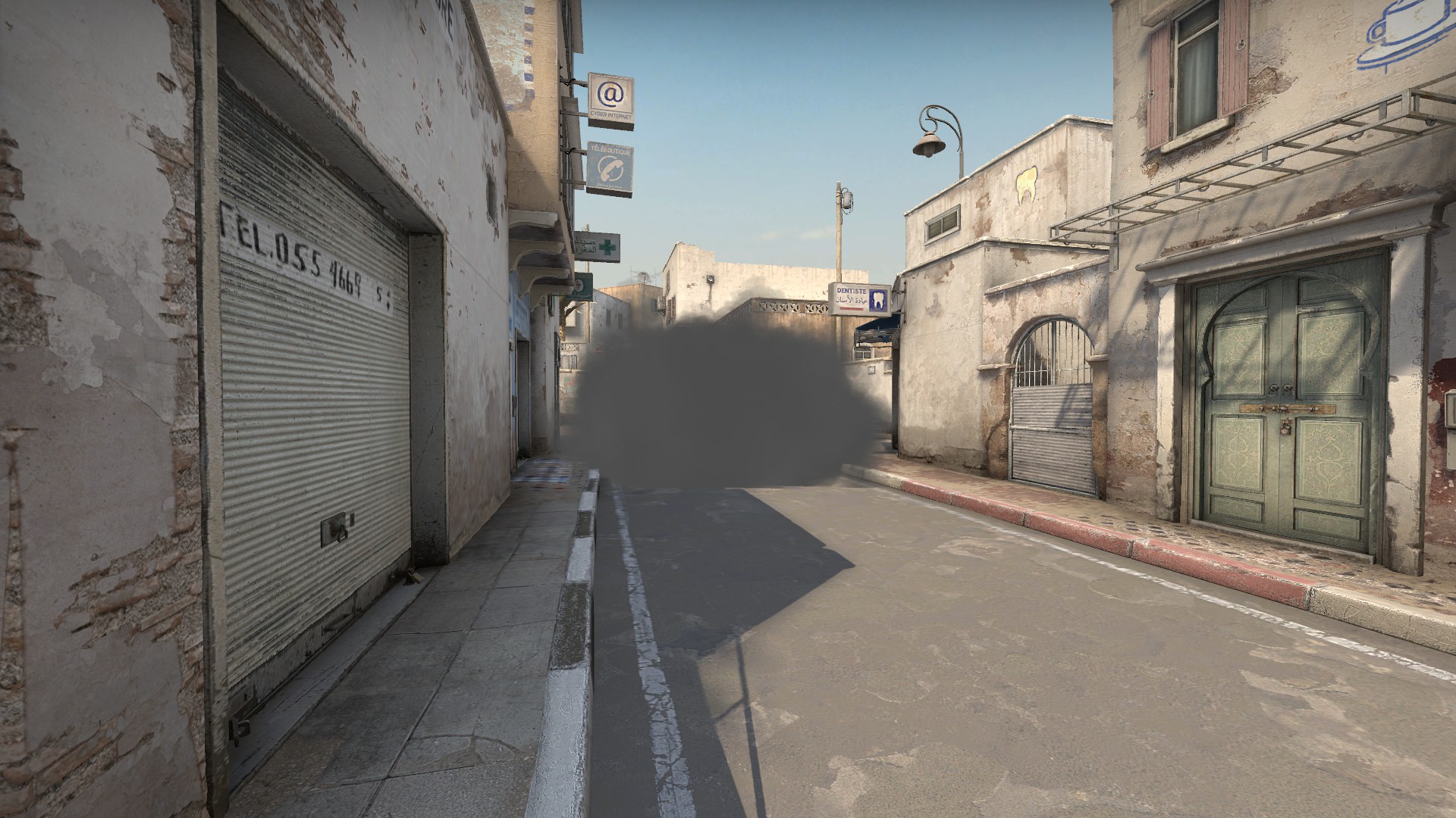
Smoke grenades deny vision. Smoking a threshold or t-junction can deny a path or allow a safe crossing. Smoking a corner create pockets of hidden information and off angles for enemies to worry about. Players can also deploy a smoke in the open, like the one pictured above, to create new angles for players to fight around. Smokes behave like cover objects in how they conceal information.


Molotovs and incendiary grenades behave as area denial. They can negate a cover object. In the picture above, my molotov is clearing out the corner behind the car. If an enemy is hiding in the corner, I would hear a hit effect of the molotov damage ticking. The enemy trapped in the corner would either have to deploy a smoke to extinguish the molotov or try to escape the flames and run into my crosshair.

There are also flashbangs, which can blind players or force them to look away for a crucial moment.

This combination of utility makes it possible for attackers to push areas like long A, but it comes at a cost. Each player can only carry so much utility, and grenades cost resources as part of a match’s persistent economy. When players throw their utility to push long A, they have made an investment that requires them to follow through before the smokes fade.

Bigger Patterns

Taken together, these details of cover form a few patterns:

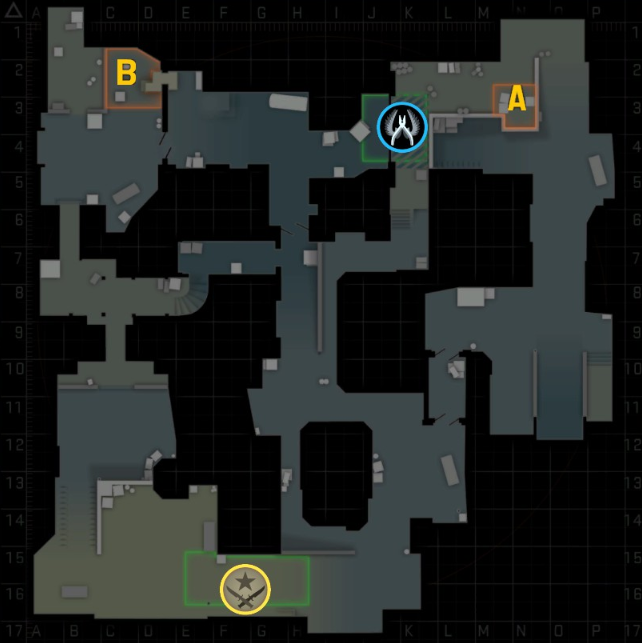
On the attacker side of the map, cover tends to be attacker-favored with opportunities to gain territory and lock defenders out from easily retaking it. I think of this pattern as “footholds”. The attacker side of long A and the upper tunnels are both attacker-favored footholds.

The objective sites are built to support defender retakes, which means they have the most freestanding cover in the map and support a wider variety of engagement angles. There may be some team-favored positions such as the cubby on B site, but these tend to come at the cost of locking a player to their position.

Separating the attacker-favored footholds from the defender sides of the map there are killzones without any cover. For B site, it is the long hall of upper tunnels. For A site, it is the long stretch of road. In both cases, the killzones require a hard commitment where attackers need to spend their limited utility to attempt the crossing.

These patterns reinforce the stages of play I described at the start, and when a map rearranges these patterns, the stages of play change too. Some Counter-Strike maps make the attacker footholds weaker, offering greater possibility for defenders to get aggressive and lock attackers out of options on the map. Other maps make path commitments harder or easier, which affects how defender prioritize positioning and resources. Even within the same game mode rules, a few tweaks to cover can make a huge difference in how a map plays.

Closing Notes

The notes above aren’t comprehensive. Cover has different quirks in every game, even within the same genre. What’s true of Counter-Strike isn’t quite true of Halo or Call of Duty. Despite that, I hope the notes above gave you some new ways to think about cover and how level design can use it.

Thanks for reading,

-Andrew

Observations on an Ice Rink

Last winter in London, Ontario, I spent an evening watching the ice skaters at Victoria Park. I first saw the skaters as a group, a few dozen people skating in a large circular pattern like one entity. But sitting to watch them, I saw more in motion at the rink than I can describe by the motions of the skaters around the ice.

There were games within games, merging, breaking off, and forming anew. There were stunts and tricks demonstrating skill, or daring, or beauty. There were chases where pairs weaved between slower skaters, treating them like obstacles in a game all their own.

There were individuals and groups. The solo skaters seemed lost in their experience, lost in the practiced motions of their bodies, faces blank with concentration. There were groups of friends teaching and supporting. A new skater shuffle-stepped across the ice, arms raised at their sides to balance and reach for their friends if they slipped. There was the turn-taking of teaching–I show, now you try.

There were couples skating together. Holding hands, the skaters’ different velocities drew them together or apart. Holding hands revealed a hidden goal of synchronicity. There were playful failures of one partner catching up to the other, or of one dragging the other behind. When one partner pushed too strongly ahead, their hands slipped apart.

With one couple, the young man was a more experienced skater than the woman with him. He skated a stride ahead without losing her hand, then turned to face her while his velocity continued forward. Skating backward now and slowing, he let his date continue on her own trajectory gently into him and his embrace. They laughed. A show of skill and confidence as flirtation.

As with the best playgrounds, the ice rink was a space for play that didn’t force specific acts. Instead, the ice rink enabled many forms of play that could shift and transform. A group of friends could split into pairs, become a chase, become a dance, become a tutorial, become a romance, and then reunify as a group of friends.

That same period of play could mean many things to each participant whose path had crossed many social worlds. For the couple falling in love on the ice, or for the pair chasing in sport, everyone else must have disappeared as others beyond the circle of their game.

I left wondering if I have created play spaces that allow for such a rich variety of social experience. Have I created games with greater depth or wider possibility than an ice rink? Have I created games where my players can fall in love?

Pieter_Bruegel_the_Elder_-_Winter_Landscape_with_Skaters_and_Bird_Trap_-_WGA03333

Pieter Bruegel the Elder’s Winter Landscape with Skaters (1565)


More About Level Design and Constraints

In my previous blog post, I described level design as constraint management. Level designers take the needs of art, design, and tech, and we try to resolve their conflicts through the process of creating our levels.

In that post I also hinted that the way we negotiate these constraints is by building level geometry; we negotiate through the process. The complexity of all these constraints is too great to solve in our heads or solve on paper; we have to build and iterate on our proposed solutions, which are our levels.

On team projects, this also means the purpose of a level blockout is to communicate with teammates across disciplines. The blockout should communicate our solution so others can evaluate if it works for their need.

But, shame on me, my previous post didn’t give examples from an actual level and blockout process! Thus, the need for this followup post.

To keep the example simple, let’s say I’m once again making a Quake 1 singleplayer map.

Imagine I already have a beginning to the map, which slowly sets a mysterious tone and sense of place in overgrown ruins. Imagine I have also introduced the basic weapons and monsters for the level, gradually raising the tension. As the player delves deeper into the ruins, the floor falls out from under them and drops them into an encounter room!

I have a few ideas for how to build this encounter:

  • At first, no enemies. The space should start as a puzzle-exploration room, then turn into a combat room.
  • There should be a clear goal for the player. I want them to see the exit in their first scan of the room but not know how to reach it. Maybe an exit to an ascending staircase that the player can see across a chasm too wide to jump.
  • As the player explores the room, looking for a way to reach the exit, they should discover a few buttons. When the player activates one of these buttons, some level geometry in the middle of the room rises, forming a platform for a few seconds, and then reverts. Individually, it isn’t clear how these buttons and platforms help. But once the player has discovered them all and tested some combinations, they grant the player access up onto a ledge, where an intermediary goal waits!
  • Because the buttons are on timers, the player should have smooth paths around the space, no awkward turns or frustrating collision. The buttons should also ideally have a view on the platforms they trigger.
  • At the intermediary goal on the ledge, there is a use-once switch. When the player activates this switch, a new platform ascends at the chasm. This new platform still isn’t enough for the player to jump all the way across to the exit, but it hints that one more platform should be enough.
  • The ledge with the intermediary goal should also show the position of the other intermediary goal so the player knows where to go next.
  • The player should now *get* what they need to do to escape. The player has solved the puzzle and now just need to complete it. This is good for player-intentionality, but it’s also boring. So now let’s add monsters!
  • I want to gradually shift the tone from puzzle-exploration to combat, so I will open monster closets in waves. This means the same puzzle space from before should also serve for combat: no awkward dead-ends or bad collision for the player or monsters to get stuck on.
  • The ambush should surprise the player. This means the monsters can’t be waiting behind locked doors from the moment the player first falls into the room; that would be obvious! I also want the player to think “ah if only I had paid closer attention, I could have anticipated!” This means no teleporting monsters into the arena. A tricky problem!
  • The monster variety during this combat encounter should escalate over time. Depending on how I’ve built the space, some monsters may not work.
  • Once the player defeats all the waves of monsters, the player should now be able to reach the other ledge and complete the second intermediary goal.
  • When the player presses the use-once switch for the second intermediary goal, a second platform ascends, completing a jumping path across the chasm to the exit.
  • As the player prepares to cross to the exit, one final wave of monsters! A “boss” wave! This may also be a great opportunity to drop in a quad damage powerup to increase the intensity. For this phase of combat, teleporting the monsters in is OK. (The player’s expectations should have shifted after the first combat waves, and they should be expecting more combat at any moment, so teleport spawning no longer feels as cheap.)
  • At last, the player kills all the monsters, reaches the exit, and returns to the rest of the level above! The encounter room is complete!

Those are my initial goals for the encounter room (revised a little for clarity). Already, I noted a few challenges in making this encounter work, but I need to build the space to see. Sketches can help me identify more of these problems before I move into the level editor. Likely, I will change my plan for the space as I build it and struggle with all of the moving parts. Then, once I’ve built the level, my pan will definitely change with playtesting.

FullSizeRender(4)

A quick sketch of the encounter, and just enough info to block out the space in the editor.

So far, the biggest conflicts in this encounter room are between gameplay types. What works well for a puzzle-exploration phase at the start might get in the way during the combat later on. For example, I want the buttons to be hidden enough that the player needs to explore the space, while for combat I don’t want the space to sprawl or become too fragmented.

The other conflict is handling the surprise. When the player first falls into the room, I need to reassure them that this is a puzzle room, that there aren’t any monsters around, nor any combat-cover, nor suspicious monster-closet locked doors. But the room still needs all of those things for the combat phase!


Untitled document(7)

Turning the encounter into a constraint diagram, there are a lot of conflicts! And this is before we consider art…

I need to solve these conflicts as I built my level. Already, this encounter room is a challenge to build well! But my constraints so far are mostly about the abstract gameplay…

Time for Nightmare mode. “Architectural Realism” adds a whole new set of constraints:

  • What was the purpose of the room originally? Who built it, when, and why?
  • How has the room fallen into this state of ruin? Is it water damage? Erosion undercutting the foundations? Was there a singular event that led to this state, like a flood, earthquake, or explosion?
  • How do the buttons operate? Are there moving chains and counter-weights that connect the buttons to the level geometry they affect? Can the player see these moving parts?
  • What purpose did these buttons and moving geometry have within the original space? Or did someone graft these features onto the ruins later on? Either way, why are they there?
  • Are these moving components used often? Or is this the first time anyone has used the space in years? Decades? Centuries?
  • Why were there monsters waiting in closets? How did they get there? Have they been there a long time? How did they survive without food and water?
  • (Etc.)

Thankfully, when mapping for Quake 1, I don’t care! (Or at least, I don’t care too much.) Quake’s chunky graphics mean that realism is off limits. I have to embrace some degree of abstraction.

Up to a point, Quake 1’s players also don’t care. Players want the level to convey a fantasy, which requires a consistent theme and governing logic. This is very flexible! If the level is a ruined temple, floating platforms are probably bad. But if the level is a floating castle in the sky, then floating platforms are probably better than grounded ones. My rule-of-thumb: if I would believe the space in a dream, then it’s good enough for Quake. (And if the space is the kind of dreamscape that would stick with me once I woke, then it’s great for Quake!)

But outside this specific example of making an encounter room for a Quake 1 map, these “architectural realism” questions often matter a lot! For western AAA games in 2020, players want spaces they can recognize from the real world, things like hospitals, cities, parking garages, offices, airports, suburbs… Even in sci-fi games, players don’t want generic sci-fi corridors; they want sci-fi hospitals, sci-fi cities, sci-fi parking garages… (This is a big generalization, of course. Some games within the Western AAA space care about “architectural realism” more than others.)

If I take my room encounter’s design from earlier and I apply the constraints of architectural realism, this is a hellish challenge. Likely, I need to change my design and loosen the constraints for art. This means stepping back from the specifics and considering my big goals with the encounter—the series of feelings I want the player to experience—rather than the implementation details such as the arrangement of buttons and platforms. From these big goals, it is easier to find a solution for these conflicts.

In practice, most levels don’t solve all of their constraints. Production imposes its own set of constraints: time, budget, team size, and scope. As a level designer / constraint manager, I need to find working solutions. I need to build foundations that solve the most important conflicts and leave room to iterate on the details and smaller conflicts from there as the team has time. Making games is messy.

In the end, the “design” in level design isn’t some magic or some lofty science exclusive to those of us with the job title. Level design as constraint management means building, testing, communicating, and iterating. This is the reality for anyone tasked with implementation, building tangible solutions to abstract goals and needs. Level design is craftwork, and that means building.

Thanks for reading,

-Andrew

What Do We Even Mean by ‘Level Design’?

I think of Design as Constraint Management. With Level Design, there is a common set of constraints each time I build a new level. Even when I’m designing for older games with a clear set of rules and expectations, there is a lot to consider.

To keep this example simple, let’s say I need to design one encounter room for a classic FPS like Doom or Quake.

Untitled document(1)

Even with a basic encounter, there are probably enemies to create combat, and there may be moving pieces, like a door opened by a switch so that players can’t skip around the enemies and escape. This gives us our Encounter Requirements, as well as demands for Combat Spacing and Functional AI! I also have to consider the Readable Layout constraint, so players can see and react to the encounter and enemies.

Untitled document(2)

Some of these constraints, like Functional AI and Readable Layout, support each other. With the example of classic FPS games, the AI use line-of-sight checks instead of path-nodes or nav meshes. This means some layout patterns can “break” the AI and trick them into getting stuck. But this also means that building clear and simple gameplay spaces for our AI to walk around also supports a Readable Layout (clear sightlines, distinct hierarchy of spaces).

In the same way, good Combat Spacing (sizes of enemies on screen, travel times of player and projectiles, distances for audio cues, room for monster closets or teleport spawns) tends to support Functional AI. Together, these constraints inform what distances in a layout feel good, and what distances to avoid because they feel bad (because AI or combat systems badly support them).

Untitled document(3)

Some of these constraints conflict. For classic FPS gameplay, the combat systems are often about pushing the player into close range against the enemies. The layouts encourage this by breaking sightlines on longer positions. Good Combat Spacing for classic FPS games also means preventing players from sitting back and chipping away at enemy health with a shotgun.

But these same layout features that help combat spacing can also hurt the layout’s readability and visual composition. A bunch of sightline-blocking pillars may be great for gameplay, but terrible for art.

Where constraints conflict, there aren’t reliable solutions for me to reuse. In one encounter room, the correct balance between these constraints may be different from the balance in the next encounter room.

The way I determine this balance for a space is by identifying the needs. What takes priority here? This means looking at the larger context, where the encounter sits in the pacing- and teaching-arcs of the level and episode:

  • Pacing-Arcs: Was there a tense combat encounter just moments before? Maybe this one can chill, focus on the art, let players use easier tactics and “cheese” enemies.
  • Teaching-Arcs: Is the encounter teaching a critical new mechanic? Maybe Thematic Consistency can step back, give the player the more abstract teaching environment that gameplay needs.

Untitled document(4)

Most of the constraints fit within a few categories: game design and game system constraints;  tech and tool constraints; and art constraints. These categories tend to be internally consistent; all of their constraints resolve. Conflicts instead tend to be between these categories.  What’s good for game design may be bad for art. What’s good for tech may be bad for game design. What’s good for art may be bad for tech and game design. And so on. There are conflicts that need resolution!

Where is Level Design in all of this?

Untitled document(5)

We’re here, at the junction of all these constraints. Our job is to resolve them. Once we have a have a workable solution, we’re on to the next problem, iterating across a whole level.

In classic FPS level design, this isn’t too bad! When it’s just me working on a level, I get to decide my priorities! Maybe I’ll ignore some of those art constraints in favor of gameplay. Or maybe I’ll ignore some of those game design constraints in favor of art? No hurt feelings if I’m the only one making the call.

However, in team environments, there may be a Game Designer who owns those systems and goals that determine these constraints. There may also be an Environment Artist who has their own interests and goals, which mean more constraints. Same with Tech Designers, Scripters, and Programmers. On large projects, each of these categories may be departments instead of individual people, and there may even be Directors for each of these categories, with varied visions and hopes for the project, expanding our network of constraints further.

Level design sits in the middle. The levels that we build are our way of negotiating between the teams and their constraints. Our levels are the field through which we iterate as a team to find the best balance possible.

So, what do we even mean by ‘Level Design’?

Sometimes Level Design means working with art, even building art ourselves. Sometimes it means working with game systems, even designing them ourselves. Other time it meas working with tools and tech and scripting. Usually it’s some mix of all three, and it varies project to project.

Building a level is the easy part. Iterating on that level and communicating with the team to satisfy all the constraints and needs—that’s what I mean by Level Design.

Thanks for reading,
-Andrew

Notes:

  1.  I stole the constraint diagram structures from Christopher Alexander’s “Notes on the Synthesis of Forms” where he proposed a mathematical approach to solving design problems. The math part is bunk, and Alexander himself came to reject it, but the diagrams are still a nice shorthand. For more on that history, check out “On Design Thinking” by Maggie Gram.
  2. For another example of Design as Constraint Management, check out Liz England’s “The Door Problem”