I’ve been keeping this blog for a while now, which means it can be tricky to find your way around. Here are some of the posts I’d recommend checking out:
Welcome back for the conclusion to this tutorial series! At this point, you should know your way around the Trenchbroom level editor and the process of compiling maps. If you have those basics down but aren’t sure how to make the jump into your first map, you are in the right place!
Compared to learning tools, the jump into design is the fun part, but it can also feel overwhelming. My goal here is to provide a variety of starting points and prompts to help you overcome the blank page. Each of these starting points comes with tradeoffs, but none of them are a wrong or bad way of starting. Whichever option excites you the most is a great way of starting!
Method 1: Gameplay First
Think about the fun mechanics available in the game and then imagine how your level could serve those mechanics. This could be the weapons, powerups, enemies, or even the stranger mechanics like doors, trains, and slime. Alternatively, think about a mechanic you don’t normally like, try to imagine a way to make it fun. I find it helps to think about this for each encounter or gameplay-beat instead of trying to solve the whole level at once.
A few examples:
An encounter featuring the rocket launcher. First empowering the player to show off the rocket launcher’s strengths, then ramping up the intensity to challenge the player.
A showcase for the Quad Damage powerup. Give the player a whole bunch of enemies to chew through. If you want to increase the challenge, make the player feel like they’re in a race to eliminate the enemies before the powerup runs out.
An encounter making use of crushers! Evade the crushers to proceed deeper into the level, or lure monsters out and under the crushers for a satisfying crunch.
Play with the monsters! A jumpscare with a spawn, a hasty retreat from a shambler, or a dancefloor filled with knights!
Above is a gameplay-first blockout of an unreleased map.
If you find that you are still struggling to imagine a gameplay encounter, I recommend doing some play-research. Look into other maps and note the moments where you feel a strong reaction: can you identify ways to improve that encounter and modify it to your own work? Are there moments you’d like to study and attempt to emulate?
Once you have an idea, experiment! The best part about the gameplay-first method is that you can quickly playtest and iterate until you are happy with the results.
A word of caution though: even when you are solving for gameplay in abstraction, you are setting up constraints for your art. You might be painting yourself into a corner. Or, if you intend to collaborate on the map with an artist, you might be passing along a bunch of hard problems and making a bad time for your artist. As you take more maps through the whole process, you will get a better sense of where you are creating problems, but expect a few surprises along the way if this is your first map.
Method 2: Art First
Imagine some striking compositions that would make a gorgeous screeenshot, or imagine some spaces that are enjoyable to move around in game. Imagine the theme, the architecture and its building materials, the mood and lighting.
If you are struggling to imagine anything, go image searching for architecture, photography, and art. As you discover things that excite you, start collecting them into a reference sheet or mood board. Reference gather is a skill in itself, and you’ll find you have a better understanding of your own tastes as you practice.
Once you have some ideas in mind, start experimenting! These experiments should help you answer some questions about how to realize your ideas within the limits of Quake.
A few specific questions to think on for your experiments:
What geometry and what textures best realize the ideas?
How do these ideas combine to create a consistent visual language and style?
How is the level lit? Will there be light fixtures?
One experiment that can help answer these questions is to build a “beautiful corner”. This is a practice in AAA environment art where you take a small part of a map that represents a meaningful sample, and solve the art to nearly final quality. From this experiment, you should solve many of the problems for the level’s geometry, textures, lighting, and overall visual language.
If you aren’t happy with the result of your experiment, you can try again. You can also go back to reference searching, informed now by the new questions your experiment prompted.
Once you are happy with a few compelling environments, you can start populating the level with monsters and items. You may find that you need to reevaluate some art decisions as you adjust for the gameplay, but Quake’s gameplay is remarkably supportive for art-first levels.
Above is my contribution to sewerjam 2. This map started from the art, and solved gameplay along the way.
As with the gameplay-first method, this art-first method comes at a cost: what works well for art may not work well for gameplay! You may find it difficult to add satisfying gameplay on top of your arted map. If you are building in a collaboration and are handing the level off for someone to add monsters and items, they may be unhappy with the constraints the art imposes.
Method 3: Fantasy First / Experience First
This method is all about the player experience, the fantasy that the level delivers as a product of both its art and design.1 Imagine an exciting player story, the kind of memorable experience a player might later tell friends about.
For example: “There’s this snow level with a spooky castle. The front gate was closed, so I had to find another way inside. I found a frozen aqueduct that led through a cistern full of zombies, but I made it inside and blew the front gate open!”
Or, “I thought I’d made it to the end of the dungeon… A horde of monsters was on my tail, but the end was in sight down the hall. I was feet away from the exit portal when a portcullis slammed down in front of me, blocking the exit! I had no choice but to turn and face the horde”.
In both of these examples, the level geometry has an identity, and the player actions are loaded with richer meaning. The level is a snow level, a dungeon, or a castle, not just abstract geometry that facilitates the gameplay. The player is infiltrating, not merely entering. Giving the level geometry identity helps the player remember it and make a story of it. Even with the gameplay focus of Nintendo’s Mario series, levels and mechanics are heavily themed to create strong identities that serve memorable player experiences.
If you are struggling to think of a player story, replay one of the original episodes of Quake. After completing each map, write a short description of how you experienced your favorite moment in the map. Think about how you would heighten the story to excite a listener, and then consider how you would apply that into improvements for the level.
Once you have a player story, build it out and playtest! From here, the work is similar to the gameplay-first method above: playtest and iterate!
The strength of this method is how it aligns art and design. “Storm a castle” is a different player fantasy than “storm the warehouse” or “storm the spaceport” even though each may share similar design. Mood has a role here, architectural identity and visual language matter, but there are also gameplay hooks to design around from the start.
The weakness of this method is that it requires you to be comfortable solving art problems and design problems simultaneously. This is a lot to ask of anyone, especially on a first map, so I recommend trying the art-first and design-first methods if you find this one overwhelming.
Another weakness of this method is a bias toward setpieces. Most Quake maps rely on “meat and potato” patterns to make up most of a level’s experience and only offer one or two setpieces to spice up the pacing and variety. “Meat and potato” gameplay has an important role as satisfying filler, but the fantasy-first method doesn’t offer clear guidance here.
Method 4: Pattern Language2
This method uses repeatable patterns as the building block for levels. Patterns can be any repeatable chunk of level geometry or entity arrangement that reliably creates good player experiences. Patterns can also be more abstract ideas, such as a method of structuring pacing to encourage an emotional journey.
A few examples of patterns:
A “loop” is a pattern of level geometry where the player or enemy movement creates a circular shape. In a loop, the middle of the circle is either filled with cover that the player can duck behind and kite enemies around, or the middle is a hazard with open sightlines across it; these are different sub-patterns with their own tradeoffs. If the player is overwhelmed by numerous foes, the loop pattern can fall apart as the player is trapped.
A “figure 8” is a pattern created by combining two loops. This gives the player more path options than the loop pattern, which makes it more suitable for higher enemy counts. As with a loop becoming a figure 8, a figure 8 can scale to create other higher-order patterns with their own tradeoffs.
There are a variety of “stair” patterns that produce interesting one-way loops with dropdowns and ledges to leash enemies in place. Sock’s levels in Arcane Dimensions use this pattern extensively to good effect.3
A “Romero lift” is a slow elevator with waves of enemies dropping in while the player is trapped waiting for the elevator to arrive at its destination. This pattern first appeared in E2M6 “The Dismal Oubliette” and is a reliable setpiece. This pattern is a little more abstract, allowing for many possible variations and reinterpretations.
A “reversal” is an abstract pattern focused on pacing and the emotional journey the player experiences. A typical reversal starts the player in a vulnerable positions against some obstacle, and once the player overcomes the obstacle, they can turn that same threat against a new wave of monsters.
In E1M3, there is a room where ogres rain grenades down on the player in a pit. Due to the height difference and the nature of bouncing grenades, the player is at a disadvantage. Once the player defeats the ogres, the player can climb up the ledge to where the ogres were, then press a button to release some zombies back down in the pit below. Now the player gets to be the one raining grenades from on high!
Turret setpieces in mid ’00s FPS games frequently follow the reversal pattern. The player faces an enemy turret and has to zigzag from cover to cover to eventually reach their flank and defeat them. Then, once the player grabs the turret, new enemies arrive and its the player’s turn to put the turret to use.
Above is my map e1m10 from Coffee Quake 2. I used several stair patterns and a partial romero-lift pattern in the design.
There are also patterns that reliably produce bad experience. These bad patterns are sometimes called “anti-patterns”. In UX there are “dark patterns”, but I feel this term is best left for patterns that have malicious intent or seek to manipulate the users. Here I’ll simply call them “bad patterns”.
A “door problem”, where the player fights from a threshold into a combat space instead of fighting in the arena, is a bad pattern that reliably produces boring, tedious gameplay.
“mazes”, where the player makes a series of blind choices to discover if they are or aren’t facing a dead end.
There are always exceptions though. Plutonia’s map11 “Hunted” takes a maze pattern and some archviles to produces a highly memorable, and terrifying, experience. Meanwhile, Kaizo Mario level design often celebrates “bad” patterns as a form of joke and challenge; some of these levels are brilliant in the ways they defy convention.4
A strength of a pattern language is modularity. You can plan out a whole level quickly with a few patterns, or even build out the level geometry without a plan by improvising on a few familiar patterns along the way. Many Quake speedmaps are built with this simple repetition of patterns as building blocks, and the Quake modding community has built up a vast range of patterns—some named, most not—in the 25+ years since the game released.
The weakness of pattern languages is that you need to build up a vocabulary to make the most of it. This takes practice trying out different patterns or stumbling into others to see what works and doesn’t. If your vocabulary isn’t rich, you may find yourself repeating the same few patterns in a way that ruins the player experience. Developing a rich vocabulary is the work of a career—it takes time. But where you find your vocabulary lacking, you can always fall back on the other methods described above, and seek new patterns when playtesting the work of others.
Conclusion
This post has been a long time coming. When I started the tutorial series in 2019, I’d only been making Quake maps for a little over a year, and I frankly was not equipped to write the above. At the time, I would have advocated strongly for a gameplay-first approach and left it at that, but this would have been an expression of my own tastes, biases, and blindspots. My experience with modding in the 4 years since then, and my continuing work in AAA, has given me opportunities to try many different methods of working, with many different struggles as a result. It is from these struggles that I believe I’ve arrived at a fair assessment of methods for mapping.
Above all, I’ve held off from concluding the tutorial due to a worry that I would create a dogma around how a mapper ought to go about mapping. There is already enough level design dogma from AAA designers (frequently with books to sell), but modding is not AAA. Even within the industry, methods vary from team to team. The best practices are the ones that can adapt to local needs.
My recommendation: experiment with different methods, adapt them as you go, think critically on ways to improve, and—if you are working with a team—make time to talk it out!
If you want people to talk with about Quake modding, I recommend heading over to Slipseer, or over to the Quake Mapping Discord. These are welcoming communities that will help you get started and provide playtesting as you experiment. They also frequently organize community mapping events, which are a great way to jump in.
Thanks for reading, now Go Map! -Andrew
Notes:
Most players don’t experience a level’s design and art as separate things. When a player likes or dislikes a level, it is because of the experience that art and design provide together. This is extremely evident in youtuber commentary where players often say things like “I like the design of this level, it’s so bright and sunny”, or “this is some bad design, the window model doesn’t match with the inside of the house”. A fantasy-first or experience-first method aims for a more organic process that aligns art and design toward a shared goal. This method also rejects the modern western AAA practice where art and design are separate disciplines. Other worlds are possible, and modding is a safe environment to explore them!
The specific terminology of Pattern Languages originates with Christopher Alexander’s The Timeless Way of Building (1979), and A Pattern Language (1977) cowritten with Sara Ishikawa and Murray Silverstein. Unlike the subject, some of the writing is far from timeless, but the way the books give praise to vernacular architecture is worth a look. The metaphor of pattern languages have also grown beyond the original books, which is closer to how I use it here.
See for example “Grand Poo World 2” by BarbarousKing, https://youtu.be/GY0HnqnYMO8?t=241, timestamped where a hidden block requires foreknowledge or the player will have to restart from the last checkpoint. BarbarousKing says it best himself: “a really mean invisible block that has killed a lot of people, and caused a lot of laughter for me”.
This spring, George McLay and I taught a two week course on Level Design and Environment Art thanks to an opportunity from the fine folks at Futuregames. Our course’s focus was on the day-to-day collaboration between Level Designers and Environment Artists. Altogether, we are pleased with the results of the course, but there are always opportunities to improve.
In starting the course, we had two big ideas we wanted the students to learn:
Players experience the game environments, which is the result of a collaboration between Level Design and Environment Art. Players don’t experience our separate disciplines in isolation. The work is fundamentally collaborative, and we succeed or fail as a team.
To facilitate collaboration and iteration, we use nondestructive workflows. Specifically, we taught the students about modular mesh workflows from a level design kit (LDK) up through an architecture pass.
However, our assignment also created a few other challenges we took for granted:
How to keep production moving. How to build fast, but also build in a way that informs collaboration.
How to overcome the blank page problem.
How to control production scope.
How to push back against problems in the work while keeping teamwork functional.
For me and George, these challenges are a daily part of the job, and we underestimated the extent these challenges could dominate the focus for some of the students.
The Assignment
On the Level Design side, I had the students create a basic lock-and-key pattern:
The player sees a goal they want to reach. This could be a narrative goal (“escape the prison!”) or an enticing landmark.
Along the way, the player encounters a lock that prevents them from reaching their goal. This could be a literal lock requiring a literal key, or it could be some other obstacle that must be overcome elsewhere.
Looking elsewhere for a way to overcome the lock, the player discovers the key.
The player returns to the lock, unlocks it, and continues on to the goal.
Crucially, I stressed that the lock-and-key pattern is a way to structure content, regulate pacing, and get more play out of less space. The lock-and-key itself is seldom the source of “fun” (or—depending on the game’s goals—satisfaction, relief, dread, accomplishment).
To make the pattern more than the lock-and-key, I required the level design students to include at least 1 encounter space. This could be a combat encounter, a boss encounter, a traversal or platforming encounter, or a puzzle. The focus of the course wasn’t on gameplay systems or scripting, so in practice this meant blocking out a larger space and having text markup that said “combat encounter”, for example. Some students took this approach a step further by marking up the design intent in detail “combat encounter starts here. Ranged enemy over there. Ambush after that here” and so on. This helped me when it came time to evaluate the levels, but it also helped the level designers communicate their intent to their artists.
On the environment art side, the assignment had them build a basic level design kit for their level design teammates to use in their blockouts. Then, once the level design student had a functional pass on the blockout and the environment art student had signed off on it, the artist would start work on a modular architecture pass. In each of these production steps, we left some room for students to iterate and push for changes when there were problems. For example, if the environment artist didn’t feel confident they could achieve an architecture pass on the blockout their level designer provided, then they needed to push back for level design iterations.
We also imposed a few constraints. First, we limited the teams to the theme of “fantasy”. I figured most of the learning would come from students talking through problems together, and it was best to keep the students within a similar problem-space. If one team was struggling to build hard-surface abstract sci-fi megatstructures, their struggles wouldn’t overlap enough with a team building a flooded medieval town for them to learn from each other.
For the second restriction, we strongly advised against organic environments (caves, cliffs, hills, islands). We wanted students to go through a modular mesh workflow, which is a much harder problem to solve in organic, irregular environments.
The Problems
If you have taught a course before, you can probably anticipate the problems from the simplified assignment outline above. George and I hadn’t taught a course before, so we stumbled right in:
Problem 1: the possibility space was too big. We allowed students to work in Unreal 4, Unreal 5, or Unity, since we weren’t familiar with their technical backgrounds prior to our course. We also didn’t require them to build with a specific game and set of game mechanics in mind, so long as they made clear in the level what kind of gameplay they intended. This meant we saw first person shooters, stealth games, puzzle adventures, platformers, and a few projects that sat vaguely in some undefined mix. Another consequence of this was a massive blank page problem for students to overcome; not only did they need to design a level, but also the game that the level would belong to.
Solution? Specify the exact game and set of game mechanics. “Make a Skyrim dungeon in Unreal 4! Your level should support stealth, combat, and magic gameplay.”
Problem 2: because we were building for an imagined game instead of one you could truly play, the level designers could only do so much to iterate on playtest feedback. Even with text markup explaining “jumpscare! monster ambush here!” it required playtesters to do a lot of work imagining, and this gave the level design students an excuse that “it’ll work better when there’s a real jumpscare here instead of a placeholder” (a problem that plagues waterfall production also, ahem).
Solution? Have the students build for an actual game. On the level design side this would be easy: have them build Quake 1 maps! Or Half-Life 2 maps! On the environment art side, this is much harder because there aren’t so many moddable games that conform to modern workflows. Even on LD side, modding may not be sufficient for their education, since the brushes->compiler workflows of Quake and Half-Life are very different from the modular mesh workflows of modern tools like Unreal and Unity.
Problem 3: assignment details lacked clarity. To grade the assignment, we needed a playable build in addition to a design pitch doc, a moodboard/refsheet, the LDK .fbx, the arch pass .fbx, and also the project files. Since different students used different tools, this became a headache.
A simple, absurd example: the assignment details for the design pitch doc did not require the students to include their names and roles on the team. As a result, many of the submitted docs did not include names. This left me and George guessing as to who was the level designer and who was the environment artist, or even if we had the right assignment for the right students.
Solution? Split the assignment deliverables into multiple sub-assignments on separate deadlines and specify exact requirements. Make tools a clear part of the assignment constraints. Have students submit their pitch docs and mood boards end of day 1, and grade them right away.
To return to the example of the pitch document, we could have provided the students with a blank form to fill in the blanks, since “how to write good pitch docs” was not one of our course objectives.
Problem 4: in the assignment rubric for the level design, one of my criteria to achieve a pass with distinction was “emotional pacing”. I gave a lecture walking through an example of the lock-and-key pattern in Half-Life 2 Episode 2 and how it provides structure to create an emotional journey of anticipation, fear, and eventually satisfaction in victory. This topic is huge and could have been its own course, rather than a single lecture and a bullet point on the rubric. The specifics of emotional pacing also depend heavily on the game genre and the tools, in the form of game mechanics and systems, that come with it.
Solution? If we have the level designers building for a specific game and constraints, then it would be easier to point to examples and specific techniques.
Problem 5: we graded both students based on their combined work. In cases where one student let their teammate down, this created unfair grades, as happens so often in group assignments. In a professional environment, you succeed or fail as a team, but in a professional environment you also have more recourse than in a classroom if your teammate is preventing you from doing your job.
Solution? Grade the students primarily based on their individual work. Make the combined work a smaller portion of their individual grades.
Thoughts for the Future
Now that George and I have done the work of stumbling through the problems above, I believe there are ways to do the course better. Going into the course, I was worried students would be frustrated by limitations on their creativity if we were too specific in our constraints. My hypothesis now is that we could fix the majority of the problems by tightening the constraints.
Specifically, a few things I would try in the future:
Require the students to build for a specific game and game mechanics. (Perhaps build a framework in Unreal for them to build with?)
Some students would be disappointed by the lack of creative flexibility, but I think there is a way to frame this limitation as a focus on craftwork fundamentals. In art classes, students study contour lines to add that skill to their repertoire, not because contour lines are the only skill that matters.
Integrate play-study into the course. Instead of giving a lecture with still images of Half-Life 2: Episode 2, play it live! Have students interrupt any time they notice something interesting, then pause and talk, or reload a save and play through it again.
I hope this structure, which I’ve seen work for film-studies and seminars, would give students ownership in identifying these patterns and what they do. The seminar structure is more student-driven instead of a forced teacher->student knowledge transmission and hierarchical “because I say so” assignments.
Require submissions along the way so we can check on their deliverables and help them adjust before its too late.
Maybe we’ll get to teach a course like this in the future and maybe we’ll encounter a whole new set of surprising problems! In the meanwhile, hopefully these notes have been useful for those of you who teach your own game development courses.
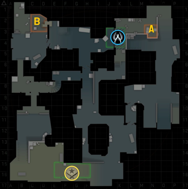
Cover objects are a core piece of a level designer’s toolbox, and there are many ways to use them. The examples below look at de_dust2 from Counter-Strike: Global Offensive, but some of the same concepts apply in other first-person shooter level design.
For those unfamiliar with the basics of Counter-Strike, the defusal game mode pits a team of attackers (Ts) against a team of defenders (CTs) in a series of 1-life rounds. The attackers win a round by planting and detonating a bomb at one of the two bombsites, or by eliminating the defenders. The defenders win a round by eliminating the attackers, defusing the bomb, or by running the clock out.
A full round of Counter-Strike tends to have a few phases of play:
Attackers probe the enemy defenses for information and opportunities to gain map control.
Attackers commit to taking one of the bombsites, spending utility (smoke grenades, flashbangs, and molotovs) to gain an advantage in the fight.
If the attackers succeed in planting the bomb, defenders now have an opportunity to attempt retaking the bombsite against the attackers. This behaves as a kind of role-swap where attackers are now defending and defenders are now attacking.
Cover plays many roles in each of these phases.
Also for context, this article isn’t about competitive Counter-Strike map theory and tactics. My interest is as a level designer and my experience with de_dust2 is as a casual player where some of these patterns play differently from how they play in the esport scene.
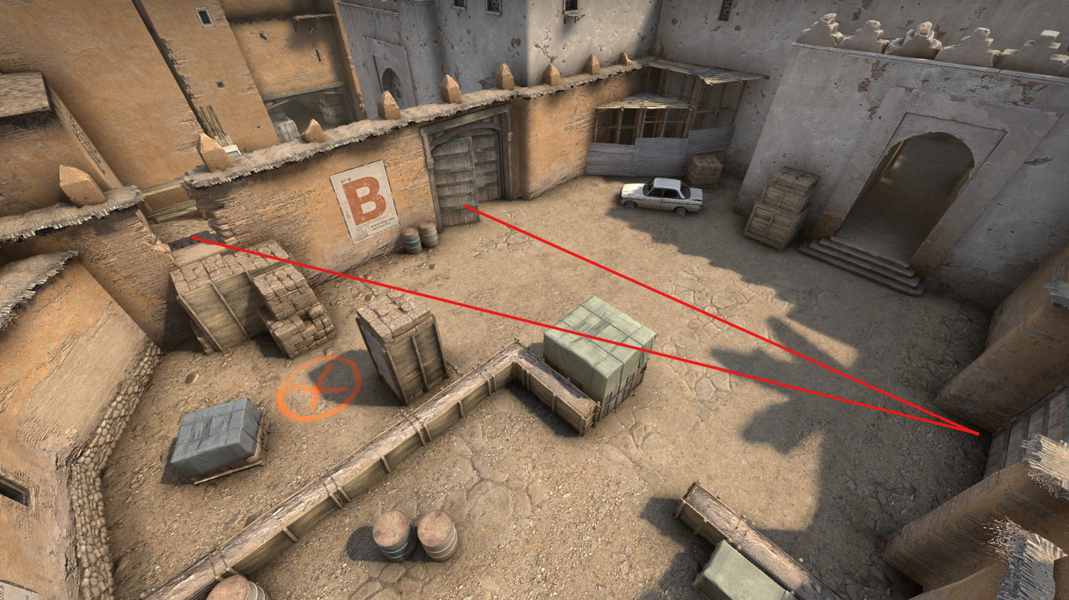
Freestanding Cover
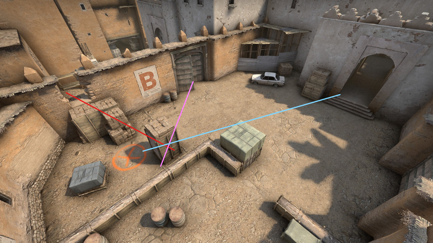
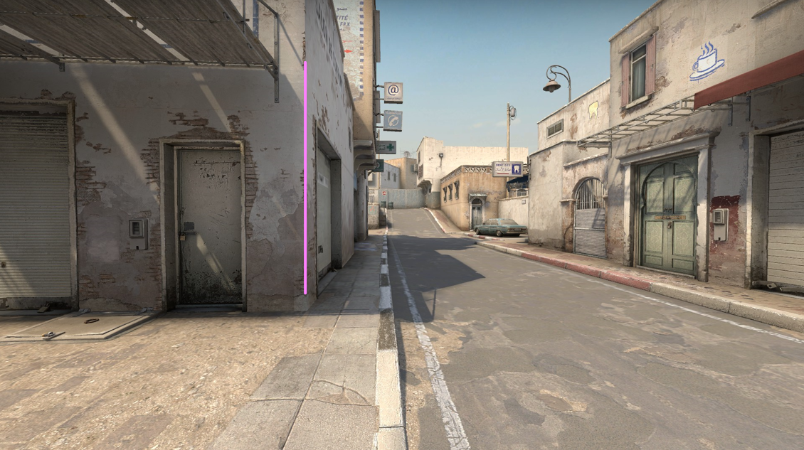
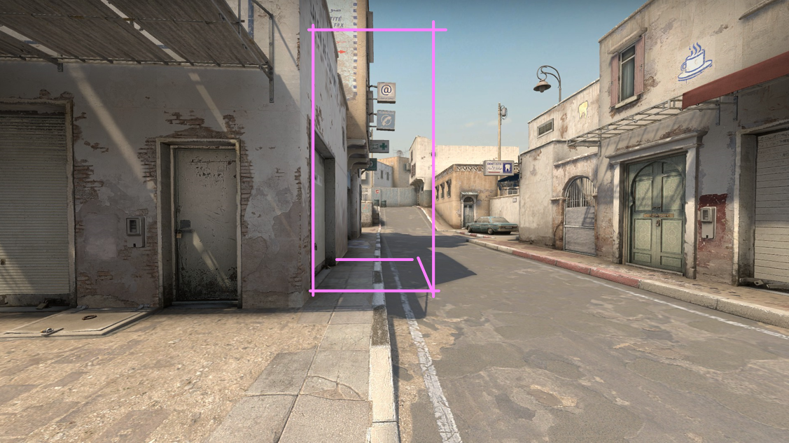
Freestanding cover objects provide a full loop of pathing around them. Players can use these cover objects to hide or hold against many angles. Here on B site for example, a player can use the tall box to hide from upper tunnels (left of image center), or to hide from window and defender arch (off screen to left)
Each line here is an angle this tall cover can block. Pink is to defender doors. Red is to window. Blue is to upper tunnel.
Freestanding cover leaves options open. A player can choose to peek from either side, loop around it, or disengage. They can choose to hold close to the cover and try to peek wide and fast, throwing their opponent’s aim, or they can try to back off and play from range. So long as they are in an even fight, they have options to play that cover to their advantage. Even in a 1v2, freestanding cover can help the outnumbered player juke and stay alive, burning precious seconds off the clock.
Because of this versatility, freestanding cover tends to work best on objective sites where players may duel or attempt to run the clock down.
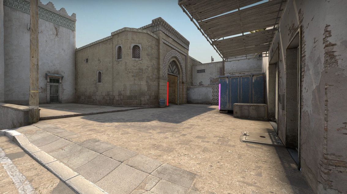
Directional or Team-Favored Cover
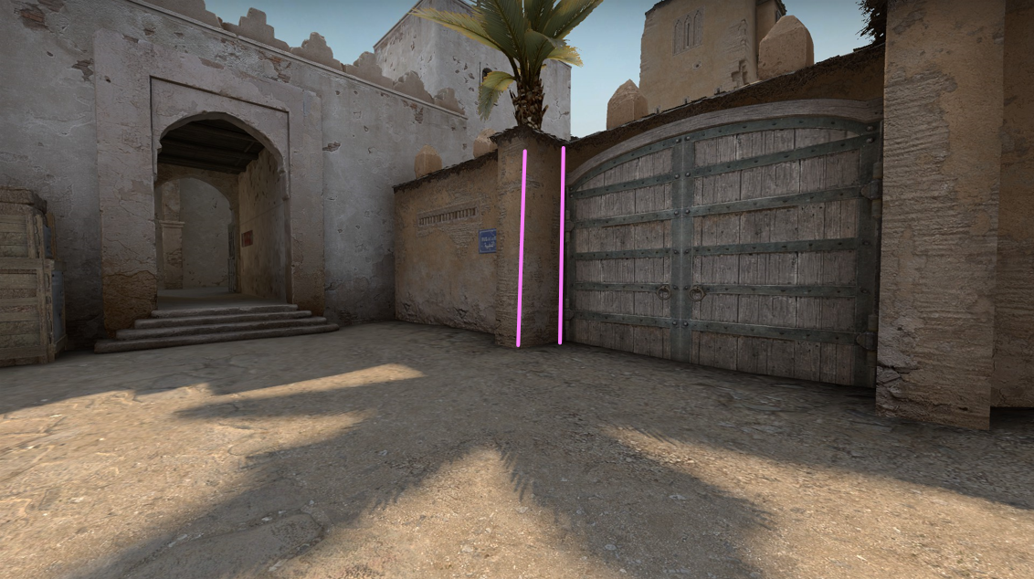
On de_dust2’s B site, there is a cubby in the wall where a large wooden gate is shut. This recess is deep enough for a player to hide behind the post and use it as cover against an attack from the upper tunnels.
The team-favored quality of cover depends on how each team approaches it. For the defending CTs, this cubby is fully visible; they don’t need to clear those angles when they enter the site. But for the attacking Ts, this cubby could hold a sneaky player, and they could lose the round if they don’t clear that angle.
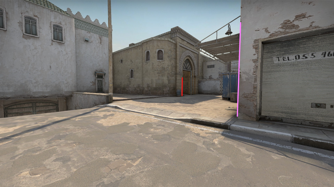
How the cubby looks to a defender holding against upper tunnel
How the cubby looks to the attacker attempting to push into B site
Even once the attacker has cleared the cubby, they can’t use this same cover against the defenders. The cover offered by this cubby is only useful against upper tunnels. Even worse, the cubby is exposed from the defender archway, which means attackers can’t use this cover when they are holding the B site against a defender retake.
Red lines mark the angles from which the cubby is exposed
Although this cubby is defender-favored, it still requires a big commitment. If attackers throw a molotov into the cubby, that defender has no good options. Unlike the freestanding cover on the site, the cubby doesn’t allow a defender to disengage without being spotted.
The cubby is also small enough that a long rifle muzzle can stick out. The defender in this cubby either needs a short-barreled weapon or to play anti-flash (looking at the wall) and wait for a teammate to provide info. A deeper corner, which could hold more defenders or give a single defender more options, would significantly shift the balance of this site.
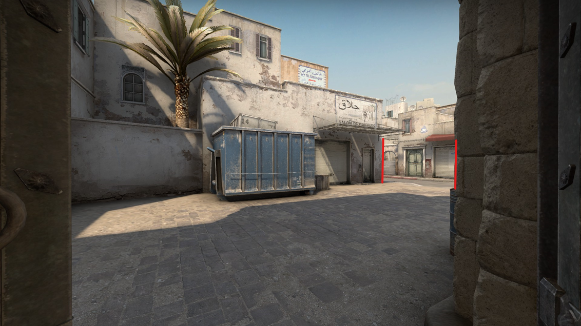
Another Team-Favored Cover
On the attacker approach to A site, there is a large blue garbage bin. This is a massive cover object creating a deep pocket of cover on either side. However, the attacker entryway to this area minimizes the cover that the blue bin could provide to a defender.
Attacker approach to long A, blue bin in center. Red lines mark the angles that attackers need to worry about.
A defender could try to tuck into the corner on their side of blue bin, but their weapon muzzle may stick out, and the shallow depth of their corner favors the attacker clearing that angle. (By having a wider sweep of the corner, an attacker would see the defender’s shoulder before the defender could see the attacker’s.)
The defender perspective onto the attacker entrance at long A and the blue bin. Red marks the main attacker entrance. Pink marks the additional angle defenders have to worry about if attackers successfully take control.
In practice, if attackers successfully make it out the threshold into long A, they can tuck behind blue bin and create a crossfire against any defender attempting to push into attacker territory. By gaining control of blue bin, the attackers can lock the defenders out of this part of the map without a serious expense of utility. If attackers don’t succeed in taking blue bin, they haven’t lost much ground because the defenders can’t use the blue bin against the attackers.
Imagine instead if the blue bin was a freestanding cover object like those crates on the B site objective. If attackers succeeded in pushing into long A, then they would have an additional angle to loop around the blue bins, making it harder for defenders to hold. On the other hand, if the attackers failed to push into long A, then defenders could also take control of the blue bin and use it to hold any further attack against long A. If defenders could use blue bin, they would effectively lock attackers out.
Pivots
A cover object pivots when players can use the same object against multiple angles. Freestanding cover objects pivot, since they can be played for many different angles, but simple corners can also pivot.
On long A, the timings from the start of a round mean that defenders arrive at this pivot corner just before attackers can push out the arch.
Defender view of long A toward the attacker arch. The pink line marks the pivot. The red line marks where the attackers will appear.
Attacker view peeking long A. The pink line marks the pivot.
This pivot behaves almost like a control point in the battle for map control. Defenders start with tentative control of this angle. If attackers succeed in their push, they can take control of the corner and use this lower part of long A as a staging area to commit to the A-site attack. Defenders could attempt retaking long A from attackers, or attackers could opt to silently disengage and leave defenders worried about an attack that never comes.
Outside of Counter-Strike, payload levels often use corners like checkpoints. Defenders start with control of a corner that lets them hold back the attack. But if attackers manage to push the defenders away from the corner, the attackers can now push up and use that same corner against the defenders into the next stretch of the fight.
Cover can also soften or harden the effect of a pivot. Imagine how some alternatives to long A might play:
Adding a full sized cover object here would create an extra pocket that attackers need to clear on their approach to the A site. To clear this pocket, attackers would be exposed to all of the angles at the top of long A. Also, if a defender has to disengage from a fight on the pivot, they would now have this safe pocket to retreat to instead of being stuck in the killzone of the long A street.
A similar cover object deeper on long A has the opposite effect. This reduces the number of angles that an attacker has to worry about when peeking the corner. It blocks off the sightline at “Goose” (the left corner at the top of the street). This cover also lengthens the distance a defender needs to retreat from the pivot before reaching safety. Attackers could also creep up to the pocket created by this cover and hold there safely, similar to how blue bin functions prior to this area.
The height of the cover also plays a role. If a players have full cover and can still throw utility over the top, this lets players extend their control of the space without stepping into an enemy’s crosshair.
However, for Counter-Strike’s gameplay, any of these cover modifications to long A could upset a delicate balance, making long A plays either the dominant tactic or a nonviable tactic.
A Note About Utility
If you aren’t familiar with the specifics of Counter-Strike, the empty stretch of road on long A may look like bad level design. In Call of Duty, this area would be a death trap, and common Call of Duty layout patterns would suggest the area needs flank routes and more cover here. However, in Counter-Strike these paths are possible in exchange for utility.
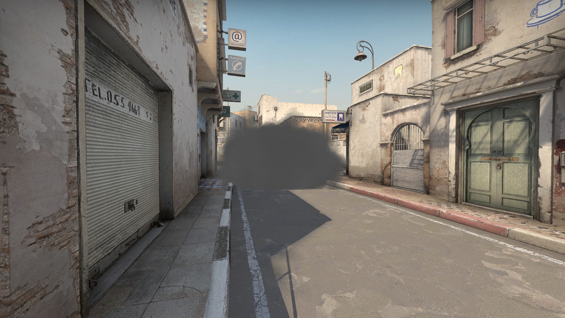
Smoke grenades deny vision. Smoking a threshold or t-junction can deny a path or allow a safe crossing. Smoking a corner create pockets of hidden information and off angles for enemies to worry about. Players can also deploy a smoke in the open, like the one pictured above, to create new angles for players to fight around. Smokes behave like cover objects in how they conceal information.
Molotovs and incendiary grenades behave as area denial. They can negate a cover object. In the picture above, my molotov is clearing out the corner behind the car. If an enemy is hiding in the corner, I would hear a hit effect of the molotov damage ticking. The enemy trapped in the corner would either have to deploy a smoke to extinguish the molotov or try to escape the flames and run into my crosshair.
There are also flashbangs, which can blind players or force them to look away for a crucial moment.
This combination of utility makes it possible for attackers to push areas like long A, but it comes at a cost. Each player can only carry so much utility, and grenades cost resources as part of a match’s persistent economy. When players throw their utility to push long A, they have made an investment that requires them to follow through before the smokes fade.
Bigger Patterns
Taken together, these details of cover form a few patterns:
On the attacker side of the map, cover tends to be attacker-favored with opportunities to gain territory and lock defenders out from easily retaking it. I think of this pattern as “footholds”. The attacker side of long A and the upper tunnels are both attacker-favored footholds.
The objective sites are built to support defender retakes, which means they have the most freestanding cover in the map and support a wider variety of engagement angles. There may be some team-favored positions such as the cubby on B site, but these tend to come at the cost of locking a player to their position.
Separating the attacker-favored footholds from the defender sides of the map there are killzones without any cover. For B site, it is the long hall of upper tunnels. For A site, it is the long stretch of road. In both cases, the killzones require a hard commitment where attackers need to spend their limited utility to attempt the crossing.
These patterns reinforce the stages of play I described at the start, and when a map rearranges these patterns, the stages of play change too. Some Counter-Strike maps make the attacker footholds weaker, offering greater possibility for defenders to get aggressive and lock attackers out of options on the map. Other maps make path commitments harder or easier, which affects how defender prioritize positioning and resources. Even within the same game mode rules, a few tweaks to cover can make a huge difference in how a map plays.
Closing Notes
The notes above aren’t comprehensive. Cover has different quirks in every game, even within the same genre. What’s true of Counter-Strike isn’t quite true of Halo or Call of Duty. Despite that, I hope the notes above gave you some new ways to think about cover and how level design can use it.
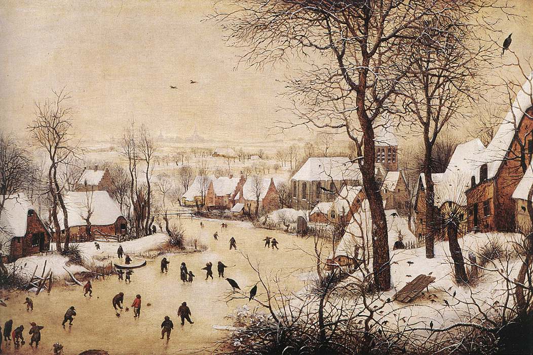
Last winter in London, Ontario, I spent an evening watching the ice skaters at Victoria Park. I first saw the skaters as a group, a few dozen people skating in a large circular pattern like one entity. But sitting to watch them, I saw more in motion at the rink than I can describe by the motions of the skaters around the ice.
There were games within games, merging, breaking off, and forming anew. There were stunts and tricks demonstrating skill, or daring, or beauty. There were chases where pairs weaved between slower skaters, treating them like obstacles in a game all their own.
There were individuals and groups. The solo skaters seemed lost in their experience, lost in the practiced motions of their bodies, faces blank with concentration. There were groups of friends teaching and supporting. A new skater shuffle-stepped across the ice, arms raised at their sides to balance and reach for their friends if they slipped. There was the turn-taking of teaching–I show, now you try.
There were couples skating together. Holding hands, the skaters’ different velocities drew them together or apart. Holding hands revealed a hidden goal of synchronicity. There were playful failures of one partner catching up to the other, or of one dragging the other behind. When one partner pushed too strongly ahead, their hands slipped apart.
With one couple, the young man was a more experienced skater than the woman with him. He skated a stride ahead without losing her hand, then turned to face her while his velocity continued forward. Skating backward now and slowing, he let his date continue on her own trajectory gently into him and his embrace. They laughed. A show of skill and confidence as flirtation.
As with the best playgrounds, the ice rink was a space for play that didn’t force specific acts. Instead, the ice rink enabled many forms of play that could shift and transform. A group of friends could split into pairs, become a chase, become a dance, become a tutorial, become a romance, and then reunify as a group of friends.
That same period of play could mean many things to each participant whose path had crossed many social worlds. For the couple falling in love on the ice, or for the pair chasing in sport, everyone else must have disappeared as others beyond the circle of their game.
I left wondering if I have created play spaces that allow for such a rich variety of social experience. Have I created games with greater depth or wider possibility than an ice rink? Have I created games where my players can fall in love?
Pieter Bruegel the Elder’s Winter Landscape with Skaters (1565)